Updates to LinkedIn Campaign Manager’s User Interface and How to Navigate It


LinkedIn’s Campaign Manager is getting a facelift! The new navigation experience is being rolled out gradually and may not be available to you yet, but it’s likely coming soon.
The purpose of the updated user interface is to increase organization and improve efficiency for advertisers using the platform. Here’s the inside scoop on the new Campaign Manager look.
WHAT IT LOOKS LIKE
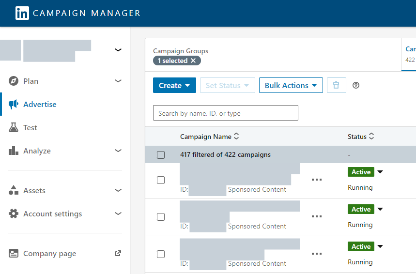
The biggest change you’ll notice is that the navigation toolbar has moved from the top of the account page to the left-hand side.
This new sidebar divides everything into eight sections, including Account, Plan, Advertise, Test, Analyze, Assets, Account Settings, and Company Page.
It should be noted that this UI update doesn’t include any new features (with the exception of Asset History – more on that later). Instead, each of these headings consolidates various aspects of the previous Campaign Manager experience.
We’ll go into detail on what each of these sections offer the user.

ACCOUNT
If you are managing multiple accounts in Campaign Manager, clicking this gives you the option to view every account you manage in the navigation window.
When listing accounts, LinkedIn will display the logo, account name, account ID, and current status of each account. It does not display create date, total spend, budget, or total number of campaigns, like the pre-update account list offered.
However, at the bottom of the Accounts section, you have the option to “View all accounts”, which takes you to the pre-update list with that additional information.
PLAN
The Plan section includes two subsections: Audiences and Block Lists.
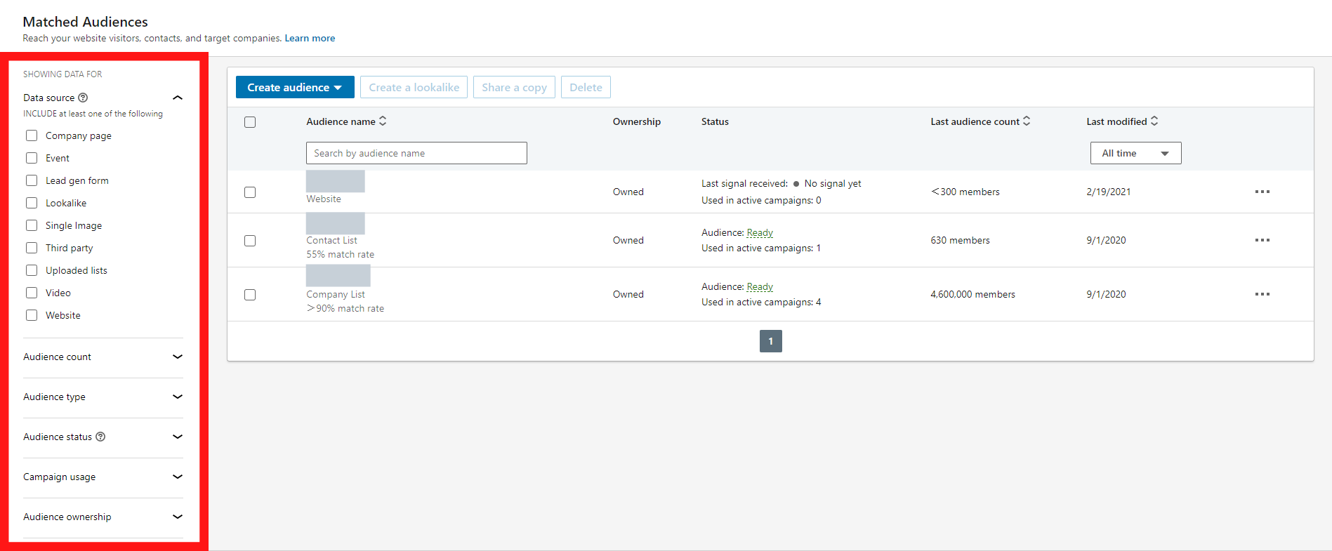
The Audience subsection is where you can access, edit, and create your Matched Audiences. However, this page has been slightly updated to better accommodate for the left-hand sidebar.
In the previous interface, you could change which Matched Audiences you wanted to view using a list of filters located in a navigation bar on the left-hand side.

Now, with overall account navigation in a sidebar to the left, these Matched Audience filters have been moved to a horizontal navigation bar just above your list of audiences.

The Block Lists tab is identical to the current Block List page in Campaign Manager.
ADVERTISE
The Advertise segment remains unchanged from the current Campaign Manager interface. As usual, this will be the main navigation page for advertisers to view and manage Campaign Groups, Campaigns, and Ads. This page also still displays the Performance Chart and Demographics tabs near the top right corner of the interface.
The Advertise section is also the first you come to when clicking into any account. From this view, you can access the other seven sections from the left-hand sidebar.

TEST
This segment offers a more recent feature called the Brand Lift Test.
LinkedIn began rolling out the brand lift testing feature last summer, 2021; you may have noticed the new “Testing” tab across the top navigation bar at the time it was being rolled out.
With the Campaign Manager update, LinkedIn is giving this testing option a bit more visibility in its UI, encouraging advertisers to take advantage.
If you aren’t familiar yet with the Brand Lift Test, what it allows you to do is measure the impact your ads have on your target audience by surveying them. The test can provide insight into what kind of effect your LinkedIn Ads have had on brand metrics, such as brand recall, brand favorability and familiarity, product consideration, etc.
These tests are free to any LinkedIn advertiser spending at least $90k per quarter.
For more information on Brand Lift Tests, click here.
ANALYZE
The Analyze section is where you can now view Website Demographics and Conversion Tracking.
These pages remain unchanged from the current LinkedIn Campaign Manager interface.
ASSETS
The Assets tab allows you to manage Lead Gen Forms, Landing Pages, and see your Asset History. The former two pages remain unchanged, but the latter (Asset History) is now where you can view assets (such as website segments, contact lists, and company lists) that have been copied or shared across various accounts you manage.
ACCOUNT SETTINGS
The gear icon that used to be in the top right corner of Campaign Manager has now been moved to this section of the interface.
From here, you can access the Billing Center, edit your account (which simply includes the option to change the name of your account), and manage user access. The inclusion of a “Settings” section makes it easier to find and access these features, especially for new users.
COMPANY PAGE
The final section is simply a quick link to the LinkedIn Company Page associated with your account. This section removes the additional click or two that was required to reach your Company Page before, so it’s not a huge change, but a welcome one.
OUR REVIEW
Overall, the new Campaign Manager is a modest content reformatting. The various features and applications that were already available to us have simply been rearranged and consolidated under sections of the new left-hand sidebar.
Most of the pages these selections drive to remain the same as they were before, but are expected to be easier to find, especially for those new to the platform.
So far, the only challenge is transitioning to this new user interface, for those of us who have been using Campaign Manager for some time now. It takes some getting used to, especially figuring out where everything is now located, but is very easy to navigate once you get the hang of it.
Have you had a chance to navigate the new LinkedIn Campaign Manager interface? What have been your thoughts or experiences? Comment below!
And if you’re currently running LinkedIn Ads but are having trouble generating qualified leads at your desired cost, reach out to our team of LinkedIn ad experts here.
Written by Shannon Bloom
