How to Use Excel for Deeper LinkedIn Ads Reporting and Insights | How to Make Sense of Your LinkedIn Ads Performance Data

There are those that love Microsoft Excel…
…and there are those that loathe it.
I used to be one of the latter. Any mention of the word “Excel” and my heart would sink into the pit of my stomach.
Like many, I simply didn’t understand how to use it.
I mean, I could use it at a very basic level, but nothing that was overly helpful in my career.
That was, until I learned this one trick I’m going to share with you today.
There’s a lot I’m still learning about Excel, but one thing is for certain: This tool is a must-have for any serious LinkedIn advertiser (and digital marketer, by extension).
Why? Because of its capability to display your data in a more digestible format.
I’m talking about pivot tables.
Whether or not you already know about pivot tables, this simple Excel feature is a game-changer for anyone looking to get more out of their LinkedIn Ads performance data.
In this article, I’ll walk you through what pivot tables are, how to use them, and also share a real example of how I’ve used pivot tables to consistently hit a client’s goal of generating leads at $30 per lead.
Let’s dive in. 🌊🤿
WHAT IS A PIVOT TABLE?
In short, pivot tables are a user-friendly tool for displaying large amounts of data.
They can be manipulated so that you see (query) only the data you care about.
Pivot tables allow you to analyze your data at a granular level and at a bird’s eye view.
HOW TO CREATE A PIVOT TABLE IN EXCEL
Creating a pivot table in Excel using your LinkedIn Ads performance data can be done in 3 simple steps.
STEP 1: EXPORT YOUR DATA
First start by opening up your account in Campaign Manager.
At the campaign level, select the date range that you’d like to view and then click the “Export” button in the top right corner.

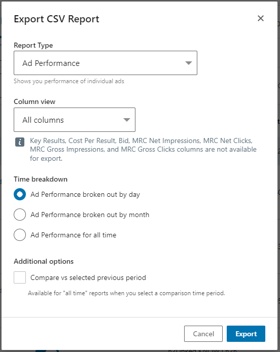
A pop up will then appear, asking you to select a Report Type.
Click the dropdown, select “Ad performance.”
Your Column view should be “All columns” and your time breakdown should be “Ad performance broken out by day.”
If all looks good, click “Export.”

A CSV file will then be downloaded to your computer.
STEP 2: CREATE YOUR PIVOT TABLE
Once finished downloading, open the file.
You’ll then be greeted by a wall of gobbely-gook.
This is your raw data. 😊
Don’t worry, it looks overwhelming at first, but that’s where our pivot table comes in.
We’re going to simplify this and make it readable.
From here, delete rows 1 – 5. You don’t need this information.
Next, select all data in the table (do this by clicking the arrow icon in the corner between column A and row 1).

Then, click the Insert tab in the navigation bar and click PivotTable.
A pop up will appear detailing the range of data you’ve selected and will give you the option to place the pivot table in a new worksheet or in an existing worksheet.
Select “New Worksheet” and click “OK.”


STEP 3: CUSTOMIZE YOUR PIVOT TABLE
With now two tabs created in your worksheet, I like to re-label these as “Raw Data” and “Pivot Table” respectively.
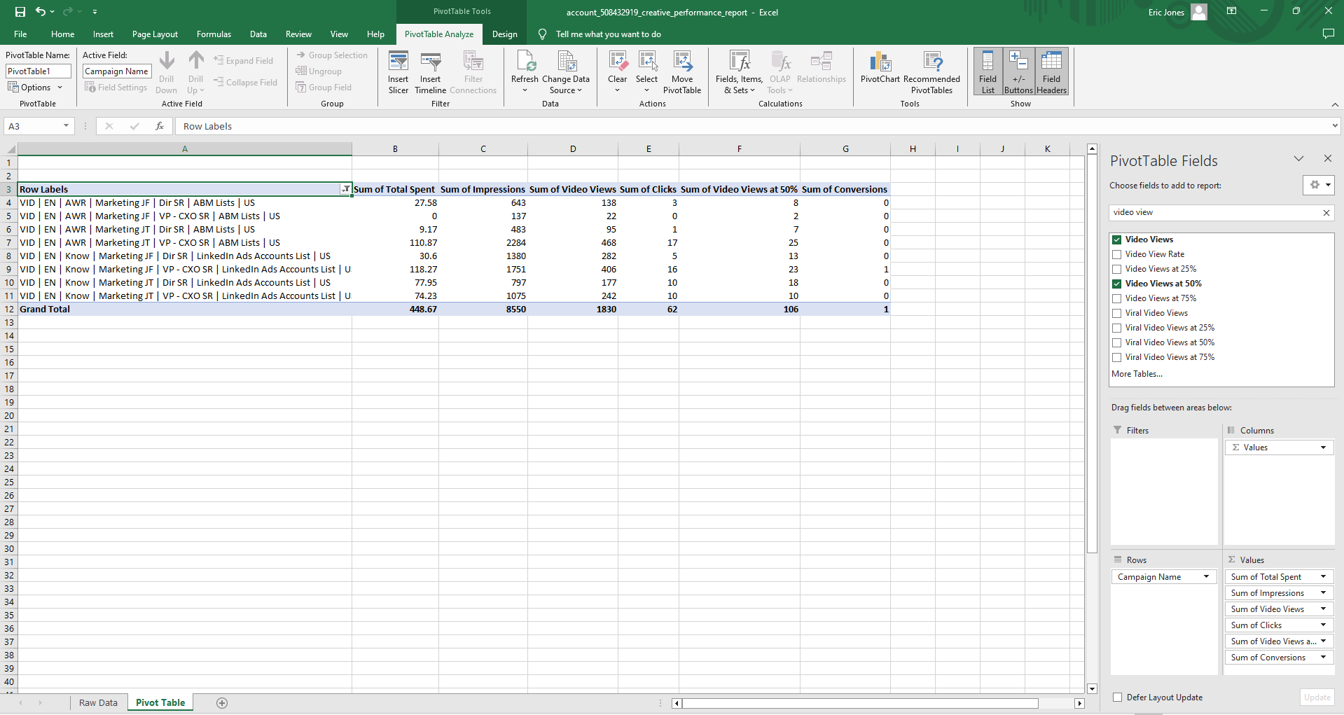
In the Pivot Table tab, you’ll see your pivot table on the left.
When clicked inside the pivot table, a window will open on the right titled “PivotTable Fields.”
This is what you’ll use to customize your table.
You can use the search bar to find the fields you want included.
Then, you can either (1) click the checkbox next to each field and Excel will automatically add them to one of the four boxes at the bottom (Filters, Columns, Rows, Values) or (2) drag and drop the fields you want into those same boxes.
For me, I like to view performance at both the ad level and the campaign level.
So I’ll create two separate pivot tables for this purpose.
In one, I’ll have Campaign Name in the Rows box, with fields like Total Spent, Impressions, Clicks, Video Views, Conversions, etc. in the Values box.
In the other, I’ll have Ad Introduction Text in the Rows box, with the same fields I mentioned before in the Values box.

Sometimes, you may want data in your table that LinkedIn doesn’t display. Pivot tables can help work around that.
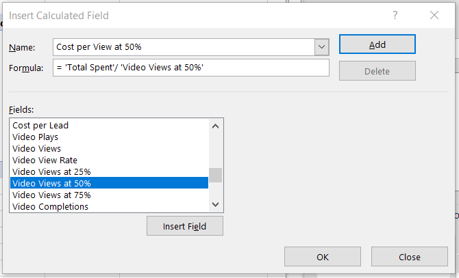
For example, if I want to see a metric like Cost per View at 50%, I can create what’s called a calculated field.
To do so, click the PivotTable Analyze tab in the navigation bar at the top, then click Fields, Items, & Sets.
In the dropdown, click Calculated Field.

In the pop up, name your new field and then use existing fields to calculate your new field in the Formula bar.
To do so, double click the field you want to use in your calculation from the list of fields provided. Excel will then add it to your formula.
When finished, click “Add” (or “OK’ if you don’t have the intention of creating more).

These calculated fields will then be added to and searchable among the list of fields in the PivotTable Fields window.
And that’s all there is to it!
PIVOT TABLES IN PRACTICE
As a Paid Media Manager for B2Linked, I managed LinkedIn Ads for a SaaS company with an aggressive goal: To generate leads at $30 per lead.
For context, an average cost per lead on LinkedIn Ads when working with a cold audience is roughly $85 – $100 per lead.
Here’s the cool part: I was able to consistently hit their goal for 2 consecutive years while they were a partner of ours.
And though there were many factors that played into accomplishing this, Excel pivot tables was among them.
So here’s how I used this tool to generate $30 leads:
BIDDING OPTIMIZATIONS
At the campaign level, Excel allowed me to easily see costs across the 70+ campaigns I was managing.
I marked in red those campaigns that were generating leads at a high CPL and low conversion rate.
Depending on the timeframe the report was pulled and how high those costs were, I would either bid down these campaigns so they spent minimally (and any results we did get would be at a lower cost) or I would pause them altogether.
In addition, I noticed there were some campaigns that had a high CPL, but also a high conversion rate.
This told me that I was likely paying too much for these particular leads.
Sure enough, more often than not, these campaigns had a high CPC, as well.
So I marked these in yellow and lowered bids on them.
A/B TESTING ANALYSIS
At the ad level, Excel allowed me to easily see which variations of ads were generating the highest volume of leads at the lowest costs.
If the results were statistically significant, I could conclude which ads to pause and which to invest more in.
WHAT NOW?
During my time at B2Linked, I’ve learned even more about how to use Excel to become a better LinkedIn advertiser.
But knowing how to use pivot tables to organize and analyze your data remains, in my opinion, one of the most pivotal (pun intended) skills to master.
We hope this guide is helpful to you in your own data analysis!
For more Excel tricks, like how to calculate your ROI on LinkedIn Ads using your CRM data, check out our YouTube channel.
And if you value minimizing waste in your LinkedIn Ads account so that you can maximize your return, consider booking a discovery call with us at B2Linked.
We’d absolutely love the chance to get to work with you!
Written by Eric Jones
